This resource was created as part of a talk I gave to architecture students at Curtin University, sharing how I approach the design of presentation panels.
As a third-year architecture student with a background in graphic design, layout and storytelling are where I feel most at home—and I’ve learned that the earlier you consider the presentation, the better your project will shine.
Here, I’ve pulled together my top tips, go-to grid structures, and visual inspiration to help you bring clarity, cohesion, and emotion into your architectural layouts.
Whether you're feeling stuck, time-poor, or just want to level up your visual game, I hope this gives you something to lean on.
> Scroll to the bottom of the page for 6 quick reference grid templates
GETTING STARTED
For me, layout design starts just like an architectural project:
+ What is the purpose of this panel?
+ Who am I speaking to?
+ What’s the core story I’m trying to tell?
+ And how do I want someone to feel when they look at it?
+ What is the purpose of this panel?
+ Who am I speaking to?
+ What’s the core story I’m trying to tell?
+ And how do I want someone to feel when they look at it?
With any project, I begin by reading the brief closely, thinking through what’s expected and what’s optional. I start drafting a list of likely deliverables—plans, sections, diagrams, renders.
Then I ask:
+ What should the viewer see first?
+ That becomes my hero image.
+ What should the viewer see first?
+ That becomes my hero image.
At this stage, I’m not drawing yet—I’m still sketching layout ideas and thinking about structure, flow, and tone.
Style & ColoUr
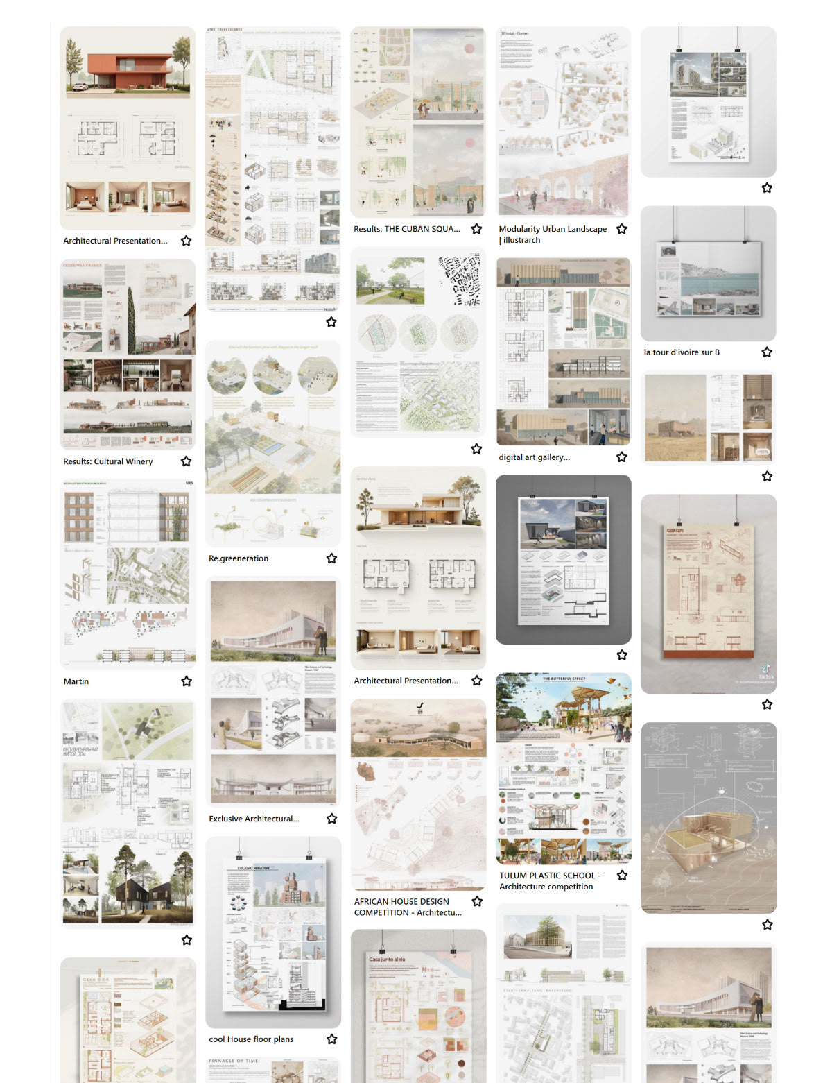
I like to do some early visual research—Pinterest, magazines, awards panels, past projects.
Not to copy, but to explore:
+ What visual style suits this project?
+ What colors express the right emotion or tone?
+ What kinds of panels feel clear and inviting?
+ What visual style suits this project?
+ What colors express the right emotion or tone?
+ What kinds of panels feel clear and inviting?
I pick a direction early and begin drafting a color palette and layout framework while I’m still researching the project.
Explore My Layout Inspiration Board
Browse the real presentation boards, style references, and layout systems that help me get unstuck:
🔗 Crafting Beautiful Layouts – Pinterest Board
🔗 Crafting Beautiful Layouts – Pinterest Board
Building the Layout
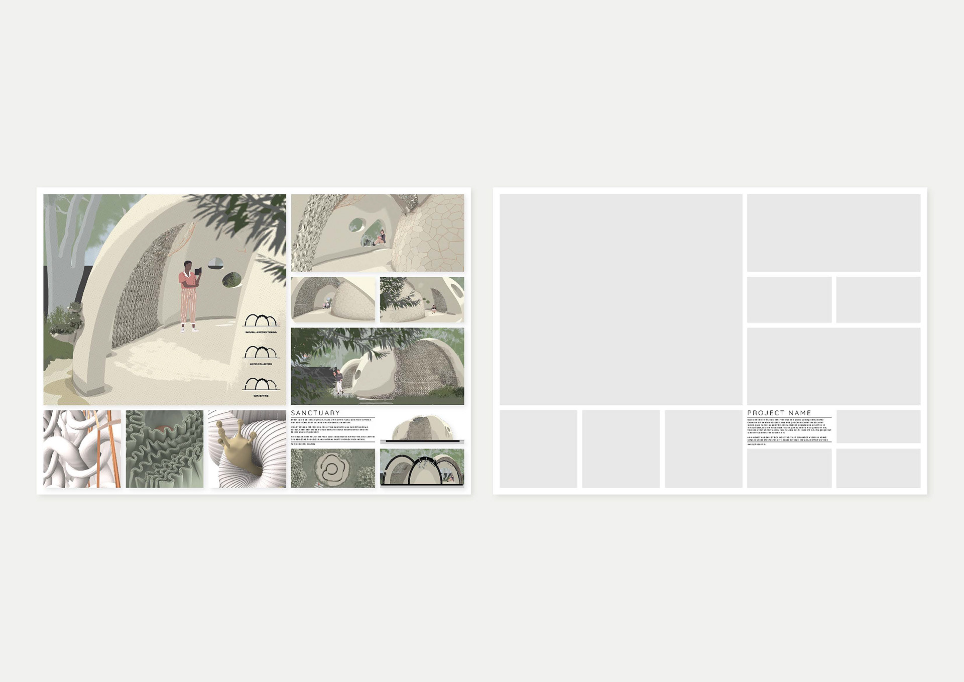
While I am able to rely a little more on instinct these days, I recommend starting with a grid. It might sound rigid, but it actually gives you freedom to play with balance and spacing.
+ I map out where the hero image will go
+ Then I block out areas for supporting visuals and text
+ I map out where the hero image will go
+ Then I block out areas for supporting visuals and text
I aim for visual harmony—you want the panel to feel cohesive at first glance, then guide the eye naturally through the content.


SCROLL DOWN FOR 6 QUICK REFERENCE GRID TEMPLATES
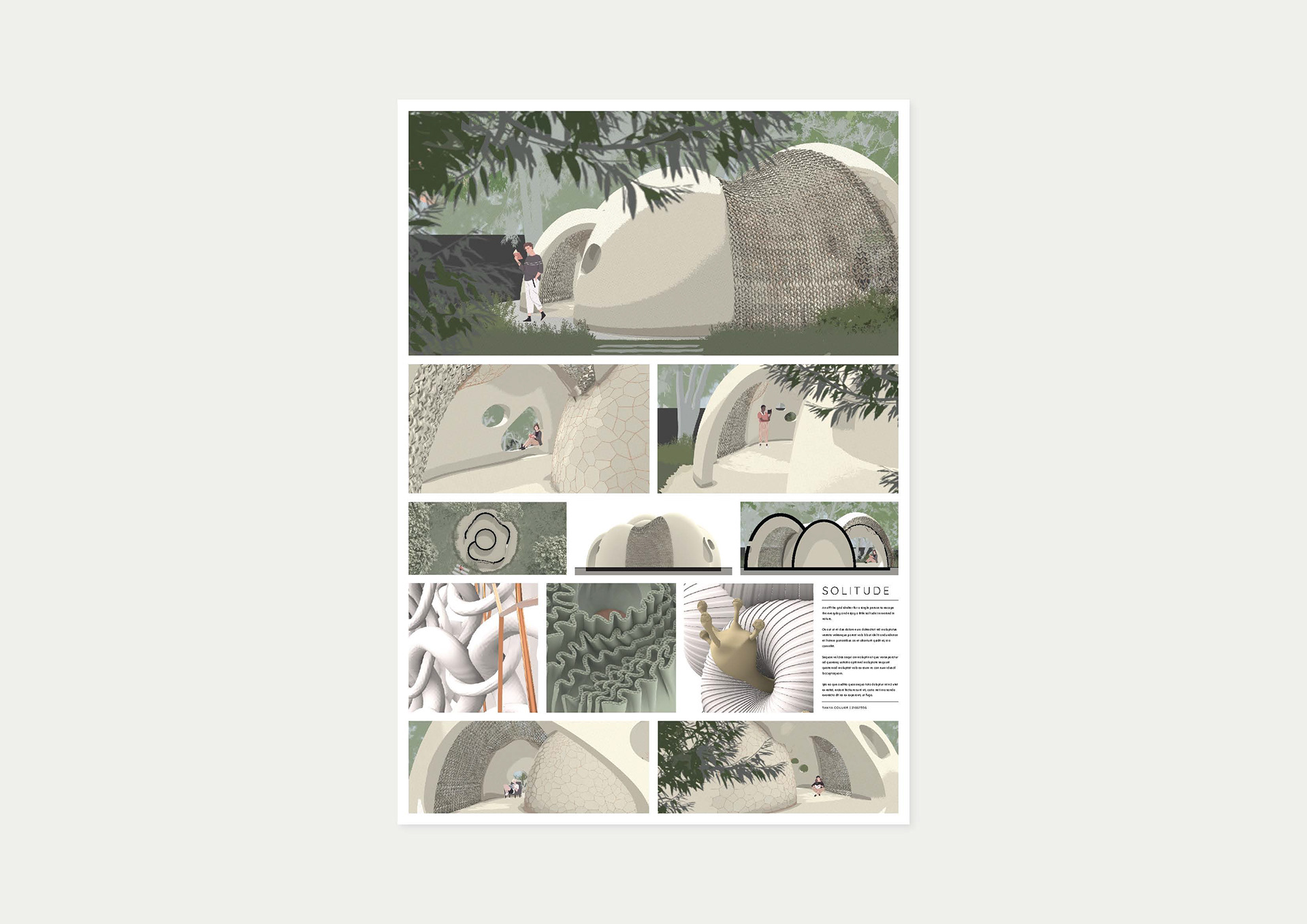
Hierarchy & Flow
This is where graphic control really matters.
Use the basic elements and principles of design to guide the viewer’s eye.
Use the basic elements and principles of design to guide the viewer’s eye.
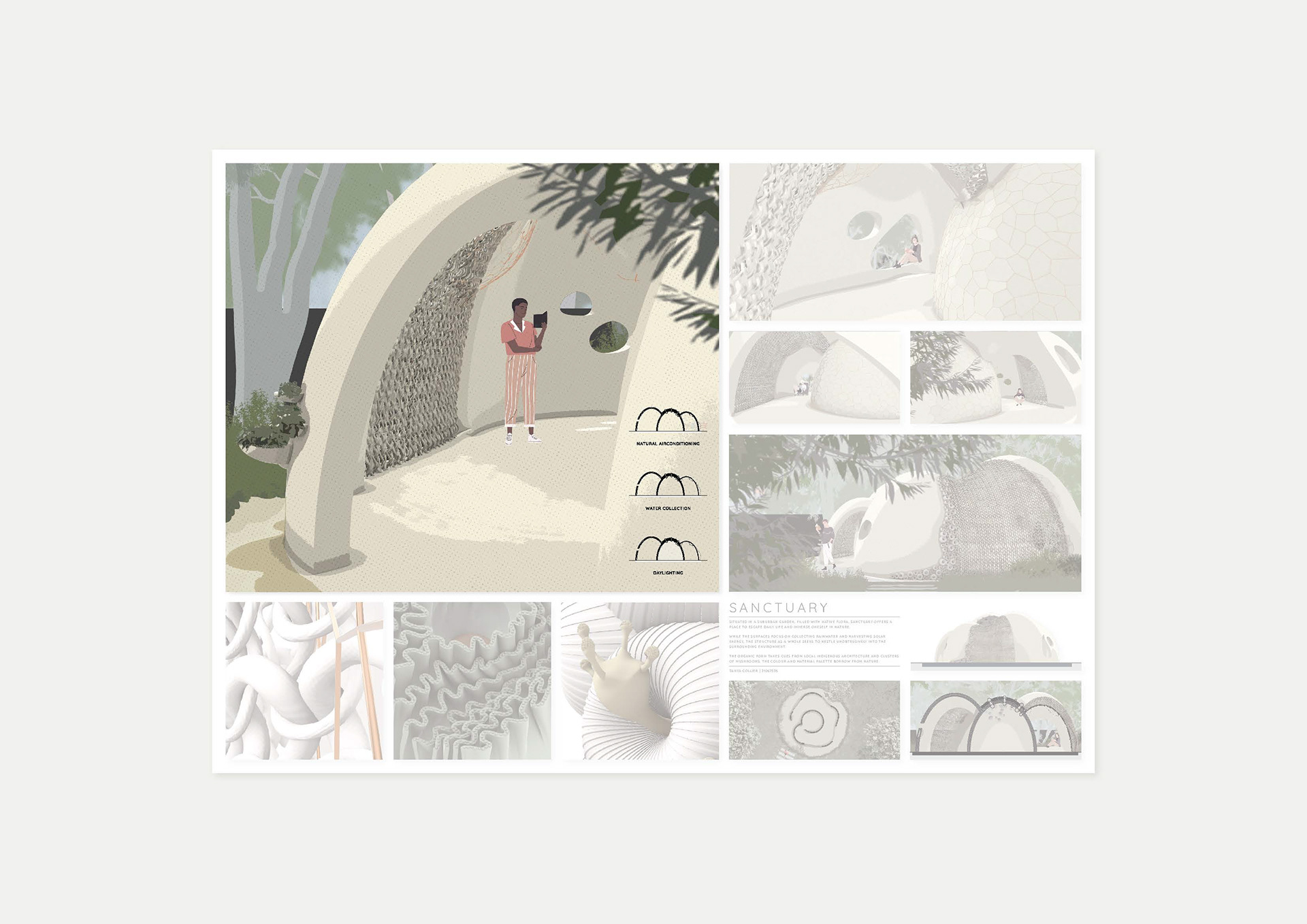
In this example:
+ I use scale—make the most important image the largest
+ I use repetition—same shapes, colors, or alignments to create rhythm
+ I use spacing—letting the content breathe is just as important as the content itself
+ I use scale—make the most important image the largest
+ I use repetition—same shapes, colors, or alignments to create rhythm
+ I use spacing—letting the content breathe is just as important as the content itself
Rather than reading left to right or top to bottom, I like to encourage the viewer's gaze to wander the panel using anchors and visual cues.
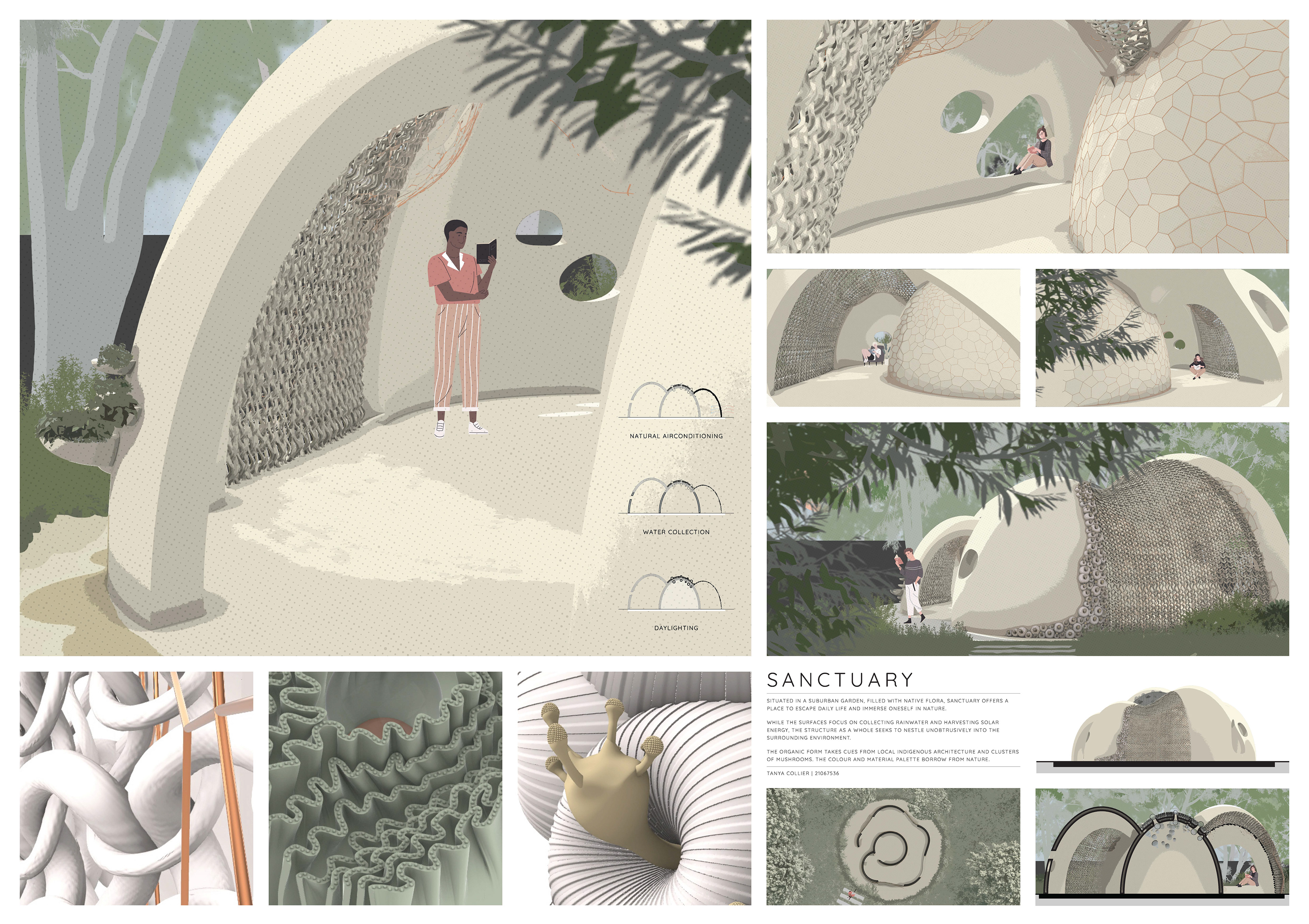
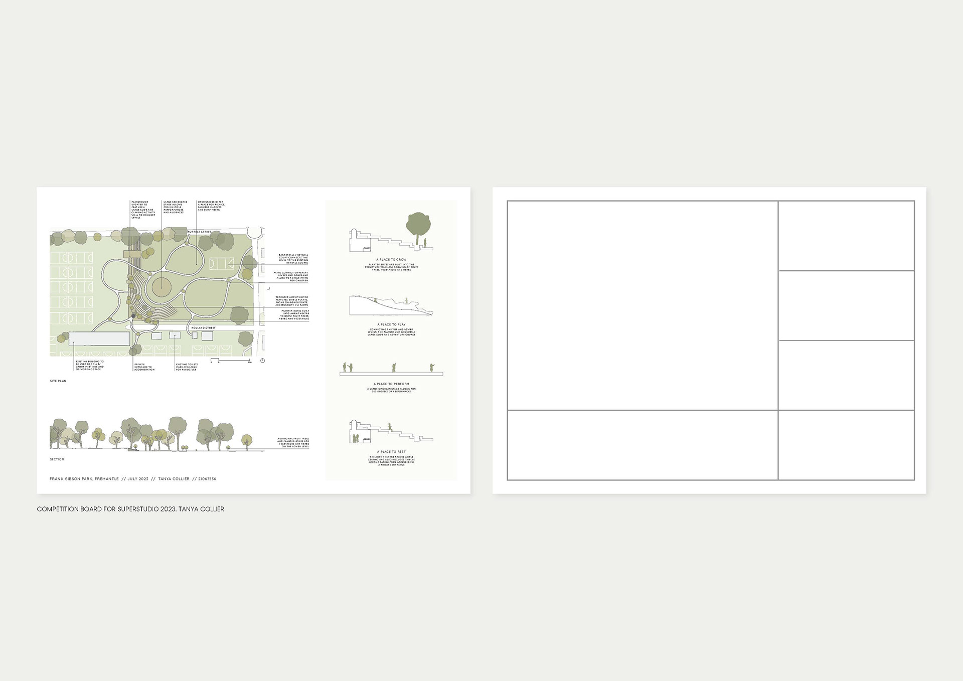
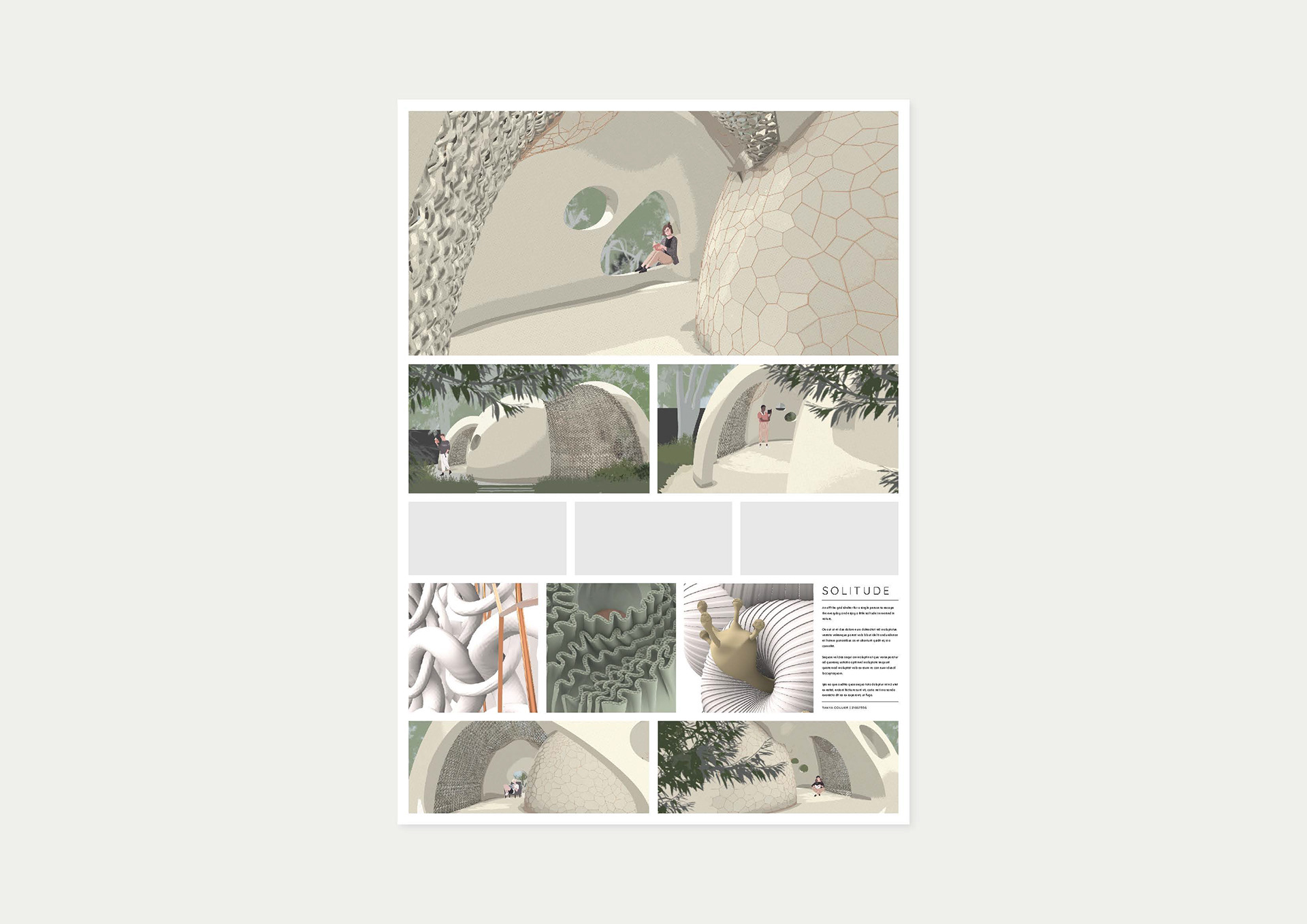
Scale is an easy way to call attention to an image
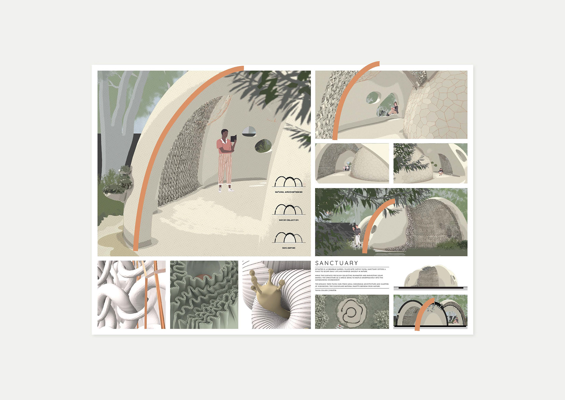
Repetition naturally occurs when you are presenting different views of the same project, but use it at different scales to help lead the viewers gaze
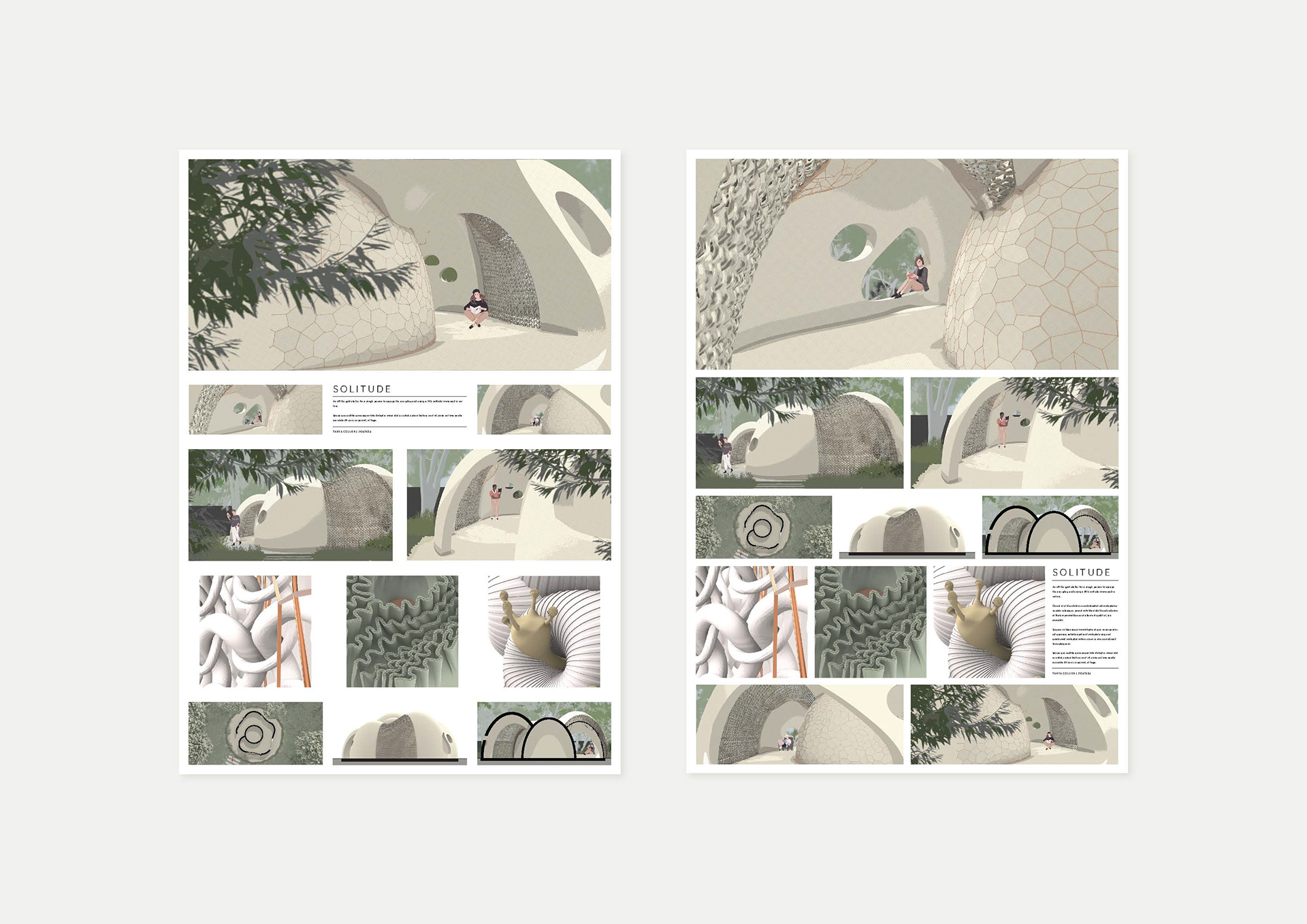
Try out different spacing to see how it affects the overall feel

Think about how the viewer's eye will wander the panel. Repetition of colour and texture are used to guide the audience
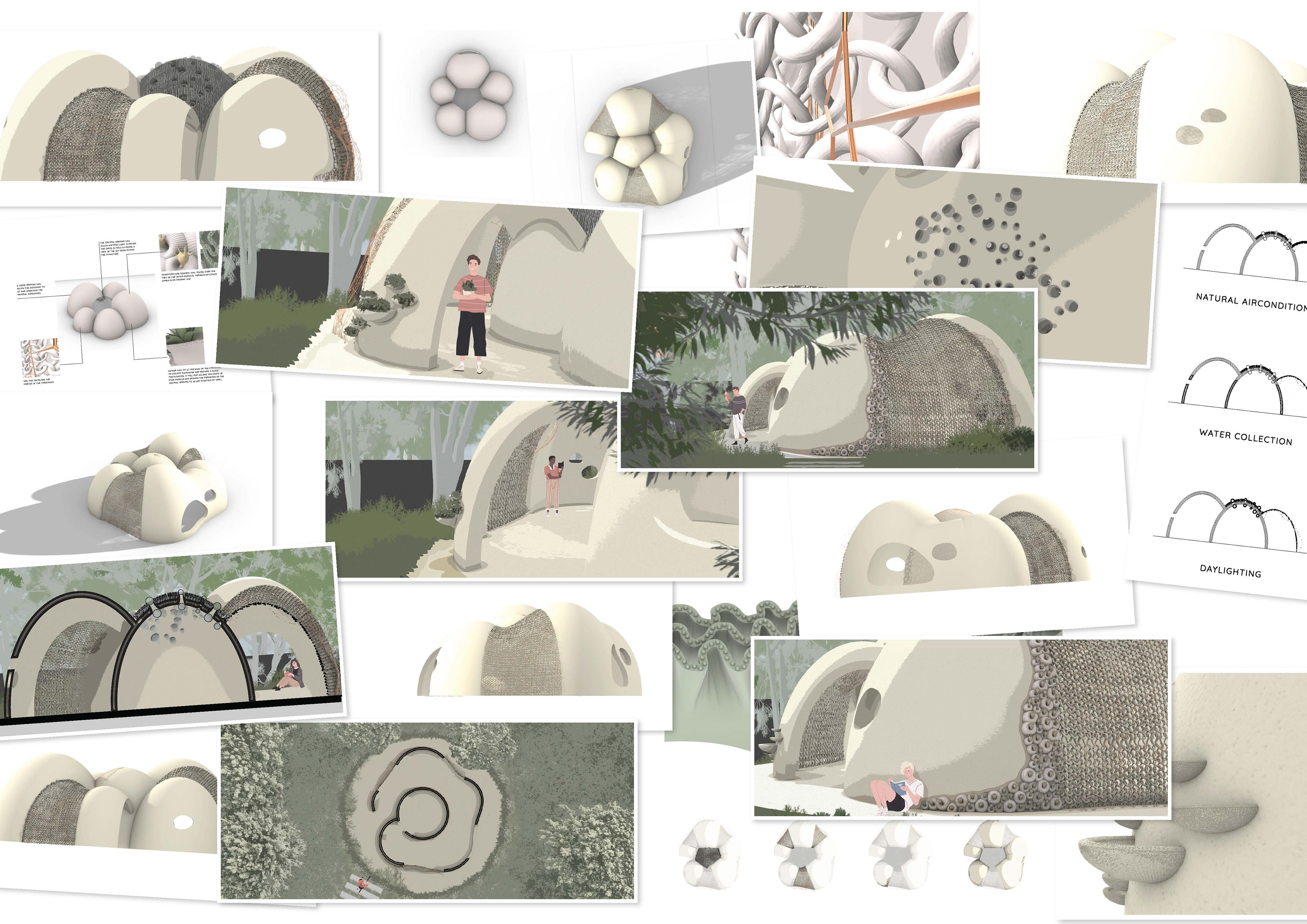
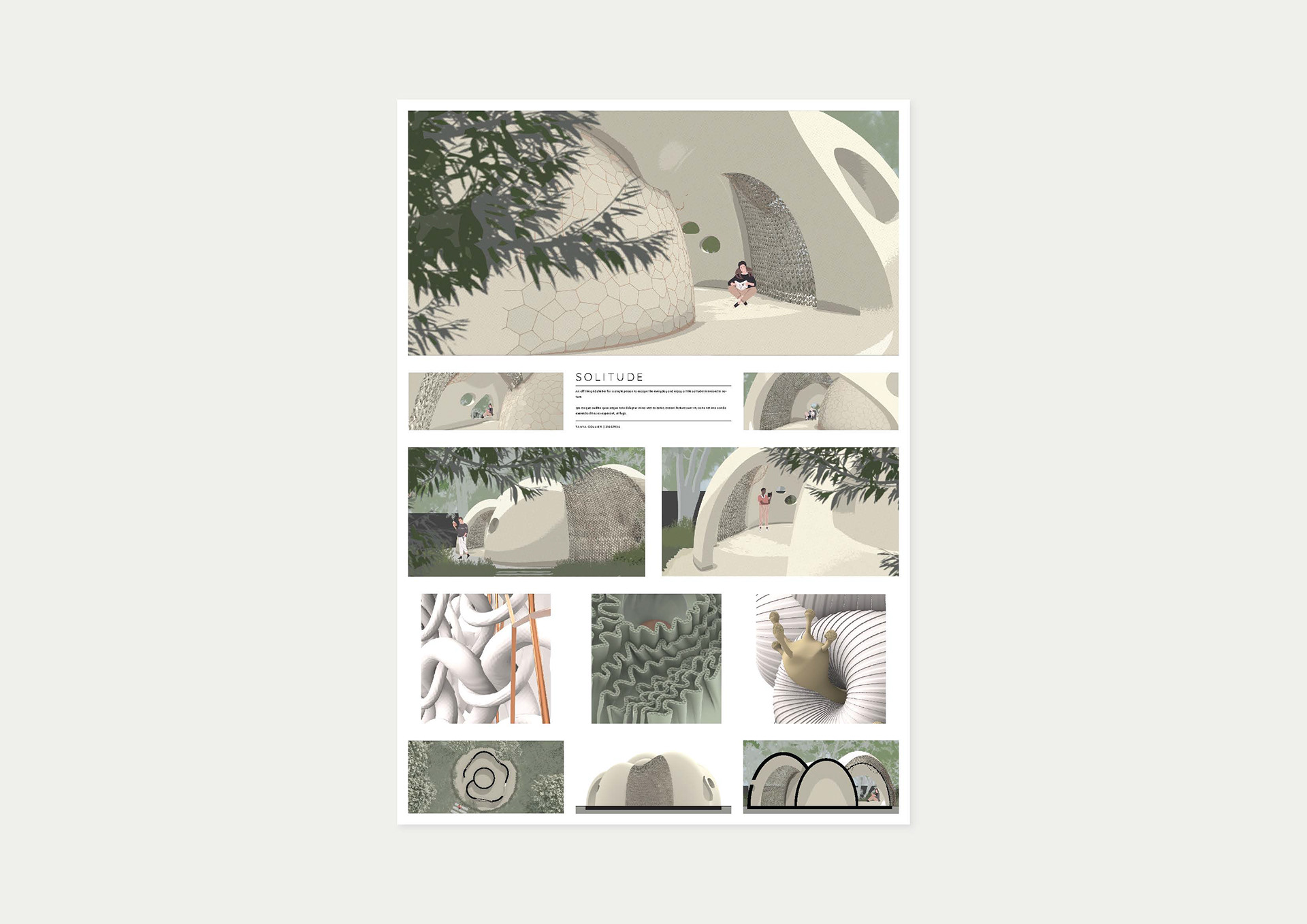
Curating & Editing Down
This part is hard but important. You can’t fit everything.
+ I ask: What adds to the story? What’s just clutter?
+ I cut anything that repeats the same information
+ I try to say more with less—a clear diagram or image often says more than three.
+ I ask: What adds to the story? What’s just clutter?
+ I cut anything that repeats the same information
+ I try to say more with less—a clear diagram or image often says more than three.
Every piece of content should earn its spot. Don’t be afraid to delete things, even if you’ve worked hard on them.
Telling the Story
I approach the panel like a narrative:
+ There’s a main message (the concept or experience of the project)
+ There are supporting moments (context, structure, atmosphere)
+ And there’s an emotional undertone—is it calm? Playful? Bold?
+ There’s a main message (the concept or experience of the project)
+ There are supporting moments (context, structure, atmosphere)
+ And there’s an emotional undertone—is it calm? Playful? Bold?
I want someone to look at my panel and feel something. That’s what turns it from a collection of drawings into a compelling design communication.
My Iterative Process
I don’t get it right the first time. No one does.
+ I’ll try many layout versions before committing
+ I’ll print it out or view it full screen
+ I’ll ask for a second opinion—someone else’s fresh eyes always help
+ I’ll walk away and look at it again tomorrow
+ I’ll try many layout versions before committing
+ I’ll print it out or view it full screen
+ I’ll ask for a second opinion—someone else’s fresh eyes always help
+ I’ll walk away and look at it again tomorrow
Even small changes—moving a label, adjusting spacing—can dramatically improve balance.


Final Tips
+ Start early—layouts take longer than you think!
+ Design with intention, not just instinct
+ Use a consistent visual language—fonts, linework, render styles
+ Think about first impressions—what’s the story in 5 seconds?
+ And finally, step away and come back later—distance gives perspective.
+ Design with intention, not just instinct
+ Use a consistent visual language—fonts, linework, render styles
+ Think about first impressions—what’s the story in 5 seconds?
+ And finally, step away and come back later—distance gives perspective.
That’s a quick overview of my process. These tips can be applied to any graphic design project - from competition boards through to your portfolio.
I know everyone works differently, but if you can:
+ Be intentional with hierarchy
+ Let your visuals breathe
+ And focus on telling the story, not showing everything—
you’ll create something expressive and clear.
+ Be intentional with hierarchy
+ Let your visuals breathe
+ And focus on telling the story, not showing everything—
you’ll create something expressive and clear.
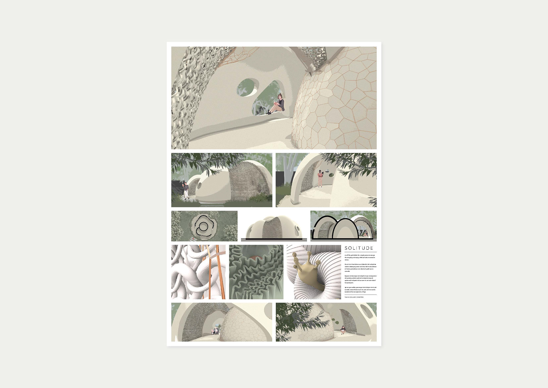
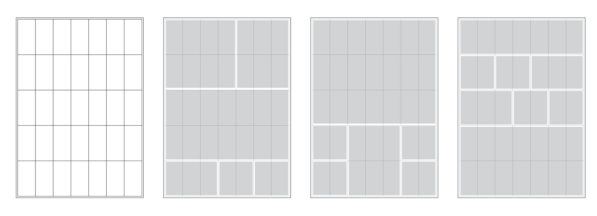
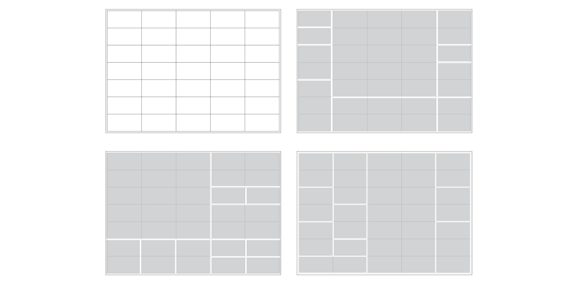
QUICK REFERENCE GRID TEMPLATES
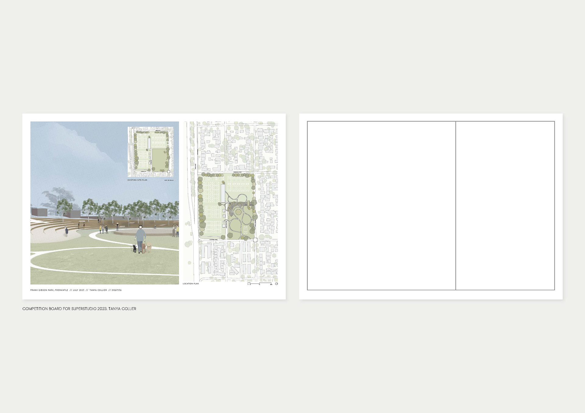
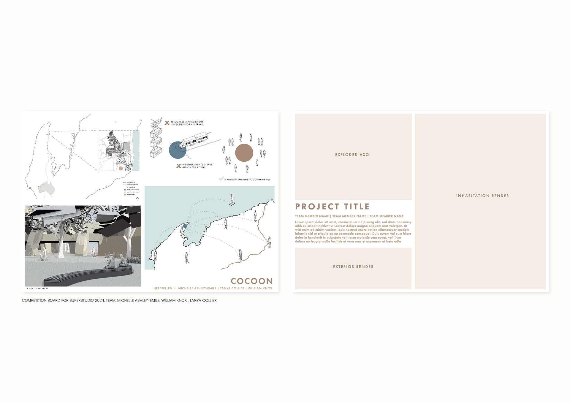
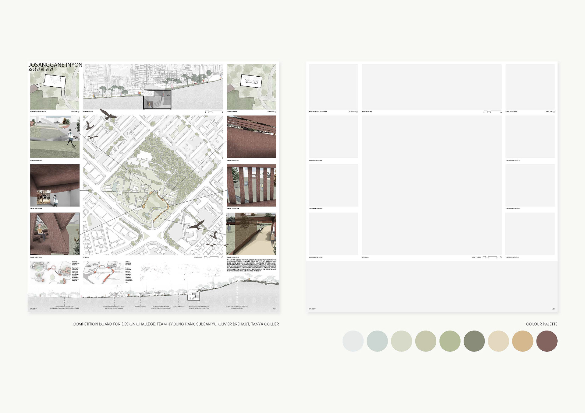
For this particular assignment, I found a 5 x 7 grid worked well, as it allows for the square needed for the 3D component.
Here's a few grid templates to get you started!
Have a question or want feedback on your board?
I'm always happy to help! Reach out via my Instagram or contact form.